In this blog we explore what spurious correlation is and how prewhitening can be used to eliminate such mistakes in our analysis of time series data. This is most important for people who wants to see cross correlation relationships between two time series.
Introduction
Have you ever noticed how two completely unrelated things can seem perfectly correlated? For instance, the price of gold and the number of people wearing sneakers might both be going up over ten years. Does sneakers cause gold prices to rise? Of course not. They are just both caught in the same “tide” of inflation and population growth.
In time series analysis, this is called Spurious Correlation. To find the real relationship between two variables, you need to strip away that tide. You need Prewhitening.
What is prewhitening?
Prewhitening is a data transformation technique that turns a “patterned” time series into White Noise.
Think of a time series like a voice recording in a windy room. The “voice” is the new information (the signal), and the “wind” is the trend or repetitive pattern (the noise). Prewhitening is like using a high-tech filter to remove the wind (the noise) so you can hear exactly what the voice is saying and when it’s saying it.
Why use it?
If you try to correlate two raw time series, your results will likely be “polluted” by:
- Autocorrelation: The fact that what happened yesterday influences what happens today.
- Shared Trends: Both variables moving in the same direction because of a third, unseen factor (like the economy).
Let’s look at an example. Let’s take a random sample of uncorrelated stocks and then check the correlation of prices without differencing.
import numpy as np
import pandas as pd
import yfinance as yf
import matplotlib.pyplot as plt
import seaborn as sns


# Download a set of mostly-unrelated tickers
tickers = ["AAPL", "MSFT", "XOM", "KO", "JPM", "WMT", "BA", "PFE", "TSLA", "NVDA"]
start = "2018-01-01"
end = None  # today

prices = yf.download(tickers, start=start, end=end, auto_adjust=True, progress=False)["Close"]
prices = prices.dropna(how="all").ffill().dropna()  # align & fill

# Correlation on price levels (often spuriously high)
corr_levels = prices.corr()

plt.figure(figsize=(10, 8))  # make the heatmap larger

sns.heatmap(corr_levels, annot=True, fmt=".2f",
            cmap="coolwarm", vmin=-1, vmax=1)

plt.title("Correlation of Price Levels Across Tickers", fontsize=18, pad=20)
plt.tight_layout()
plt.show()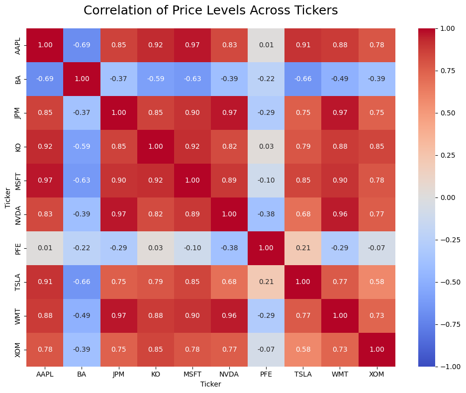
These stocks appear highly correlated in price levels, but this correlation is largely driven by shared long‑term trends rather than true economic co‑movement. This is a form of trend‑induced or non‑stationary correlation, which is why we compute correlations on returns instead of raw prices.
Prewhitening fixes this by ensuring that you are only correlating the “shocks” or “surprises” in the data. If a surprise in Stock A consistently leads to a surprise in Stock B, you’ve found a genuine lead-lag relationship.
When to Use It?
You should reach for prewhitening whenever you are:
- Checking Lead-Lag Relationships: “Does the S&P 500 price move before the bank interest rates change?”
- Building Predictive Models: If you want to know if Variable X is a reliable predictor for Variable Y.
- Cross-Correlation (CCF): Before plotting a CCF, prewhitening is standard practice to avoid “fake” spikes in your graph.
How It Works: The 3-Step Workflow
- Model the Leader: Find the internal pattern of your first variable (usually using an ARIMA model). Basically fit an ARIMA or ARMA model to the data.
- Extract the Residuals: Strip that pattern away. What’s left is the “White Noise” (the prewhitened data).
- Apply to the Follower: Use that same filter (eg: if you used ARIMA(1,0,1) you need to use the same thing for the follower) on your second variable. Now, you can compare them fairly.
Lets try this: Example
First lets do this for AAPL stocks and JPM stocks which are in two different sectors.
Best way to do this is to use pmdarima, which is a python auto-ml library that automatically identifies the best model. If you don’t have this package install it using the following command.
pip install pmdarima
Lets download the data from yahoo finance api using the yfinance python library. Assuming the leader is AAPL which is the stock that moves first, we model is it as follows.
import pandas as pd
import yfinance as yf
import pmdarima as pm
from statsmodels.tsa.stattools import ccf

# 1. Download AAPL and JPM price data
tickers = ["AAPL", "JPM"]
df = yf.download(tickers, start="2018-01-01", end=None, auto_adjust=True)["Close"]

# 2. Convert to returns (stationary input for ARIMA)
returns = df.pct_change().dropna()

# 3. Fit ARIMA to the "leader" series (AAPL)
model = pm.auto_arima(returns['AAPL'], stepwise=True)

# 4. Prewhiten both series using the SAME ARIMA order
aapl_white = model.resid()
jpm_white = pm.ARIMA(order=model.order).fit(returns['JPM']).resid()

# 5. Cross-correlation of prewhitened residuals
correlation_lags = ccf(aapl_white, jpm_white)

print("Cleaned correlation at Lag 1:", correlation_lags[1])The results we get for the correlation is -0.0721. This is significantly different from the initial correlation we got before prewhitening which was 0.85.
If we test this to the entire ticker base assuming AAPL as the leader, we get the following results.
import pandas as pd
import yfinance as yf
import pmdarima as pm
from statsmodels.tsa.stattools import ccf
import seaborn as sns
import matplotlib.pyplot as plt

# Tickers
tickers = ["AAPL", "MSFT", "XOM", "KO", "JPM", "WMT", "BA", "PFE", "TSLA", "NVDA"]

# 1. Download price data
df = yf.download(tickers, start="2018-01-01", end=None, auto_adjust=True)["Close"]

# 2. Convert to returns
returns = df.pct_change().dropna()

# 3. Fit ARIMA to the leader series (AAPL)
leader = "AAPL"
model = pm.auto_arima(returns[leader], stepwise=True)

# Prewhiten leader
leader_white = model.resid()

# 4. Prewhiten all other tickers using the SAME ARIMA order
cleaned_corrs = {}

for ticker in tickers:
    if ticker == leader:
        continue

    resid = pm.ARIMA(order=model.order).fit(returns[ticker]).resid()
    corr_lag1 = ccf(leader_white, resid)[1]
    cleaned_corrs[ticker] = corr_lag1

# 5. Convert to DataFrame for heatmap
corr_df = pd.DataFrame(cleaned_corrs, index=[leader])

# 6. Plot heatmap
plt.figure(figsize=(10, 2))
sns.heatmap(corr_df, annot=True, cmap="coolwarm", vmin=-1, vmax=1, fmt=".2f")
plt.title("Prewhitened Cross-Correlation at Lag 1 (AAPL vs Others)", fontsize=16)
plt.tight_layout()
plt.show()
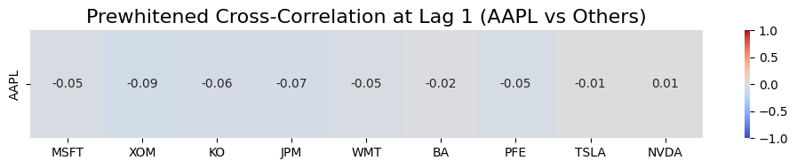
Interpretation of above plot
The Lag: “Lag 1” means we are checking if Apple’s movement today predicts the other stocks’ movements tomorrow.
The Numbers: These are correlation coefficients ranging from -1.0 to +1.0.
- Positive (+) values: The stock tends to follow Apple’s direction the next day.
- Negative (-) values: The stock tends to move in the opposite direction of Apple’s previous day.
- Near Zero (0.00): There is essentially no predictive relationship.
Example: XOM (-0.09): After removing each stock’s own autocorrelation, when Apple has a positive “surprise” today, Exxon’s next-day surprise tends to be slightly negative. In simple words, it suggests that when Apple has a surprise positive day, Exxon often has a slight negative reaction the next day. This reflects the classic “Tech vs. Energy” rotation where investors move money between sectors. However this is very small.
How to select the leader in the above analysis?
1. The Liquidity Rule
The stock that trades the most volume typically processes information faster. In any pair, start by looking at which ticker has the highest Average Daily Volume.
- Leader: AAPL (High liquidity, global retail/institutional interest).
- Follower: A smaller tech stock or a sector ETF that reacts after Apple’s earnings or product launches.
2. The “Information Source” Logic
Ask yourself: Where does the news hit first?
- If comparing AAPL and NVDA: Is Apple the leader because it’s a massive customer of chips, or is Nvidia the leader because chip supply dictates Apple’s production?
- Usually, the Upstream company (the supplier) or the Market Bellwether (the biggest player) is your statistical leader.
3. Let the CCF Plot Decide
If you aren’t sure, run the Cross-Correlation Function (CCF) for both. The math will “expose” the true leader:
- Positive Spike at Lag +1: Your chosen leader (X) is correctly leading the follower (Y).
- Positive Spike at Lag -1: You have it backwards! The stock you labeled as the follower is actually leading the other.
Bottom Line
Prewhitening is the difference between seeing a “coincidence” and seeing a “cause.” By removing the internal echoes of a time series, you allow the true relationship between variables to speak for itself.
Pingback: Beyond Correlation: Are Your Stocks Cointegrated or Just Casual?